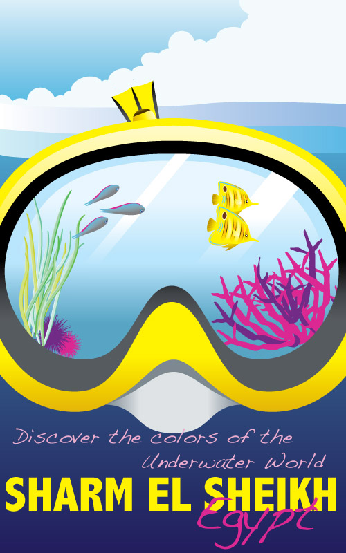
Here’s another assignment from my sessions.edu online program’s Color Theory class..
The assignment here was to create a travel poster of my choice, and considering readability and contrast in regards to using type. The exception here is to not use any color photography.
An essential recommendation from the instructor, and this could be useful to anyone working on a poster, is to start of with using two to four colors and then filling in the rest with different values of each color and/or different intensities.
Here I chose Egypty’s Sharm El Sheikh; I wanted to project the exciting adventures of the sea and sea activities that is one of the things Sharm is very well known for.

0 Responses to “The Color Theory on a Travel Poster..”